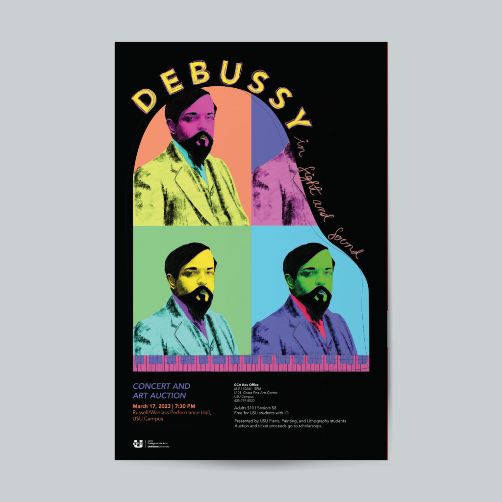
This is aThe client wanted a poster that felt like pop art but still spoke to the piano pieces that were to be played at the event. The bright colors and repetition of the portrait of Debussy helped to mimic that 'Andy Warhol' feeling they wanted. I also liked the texture that the messy lines and hand illustrated flourishes gave this poster to instill the feeling of a fun and relaxed atmosphere.
Debussy in Sight and Sound
The client wanted a poster that felt like pop art but still spoke to the piano pieces that were to be played at the event. The bright colors and repetition of the portrait of Debussy helped to mimic that 'Andy Warhol' feeling they wanted. I also liked the texture that the messy lines and hand illustrated flourishes gave this poster to instill the feeling of a fun and relaxed atmosphere.
Jazz Combos
This is aThe client wanted a poster that felt like pop art but still spoke to the piano pieces that were to be played at the event. The bright colors and repetition of the portrait of Debussy helped to mimic that 'Andy Warhol' feeling they wanted. I also liked the texture that the messy lines and hand illustrated flourishes gave this poster to instill the feeling of a fun and relaxed atmosphere.
Debussy in Sight and Sound
The client wanted a poster that felt like pop art but still spoke to the piano pieces that were to be played at the event. The bright colors and repetition of the portrait of Debussy helped to mimic that 'Andy Warhol' feeling they wanted. I also liked the texture that the messy lines and hand illustrated flourishes gave this poster to instill the feeling of a fun and relaxed atmosphere.
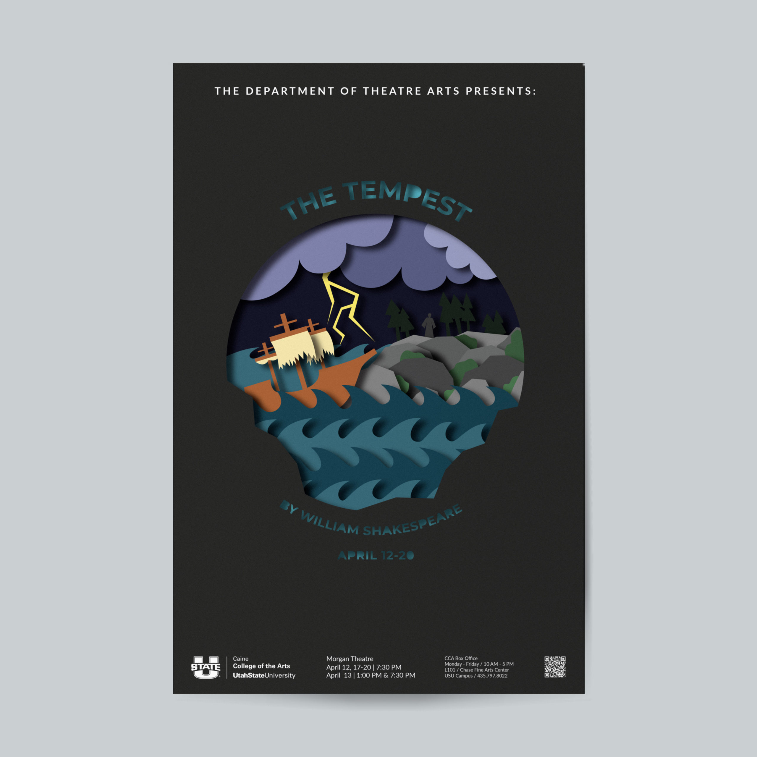
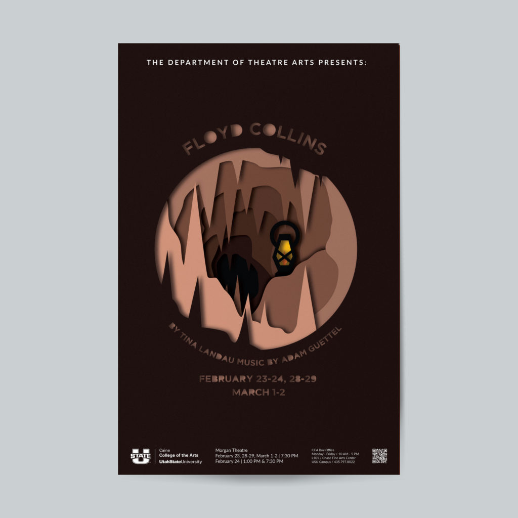
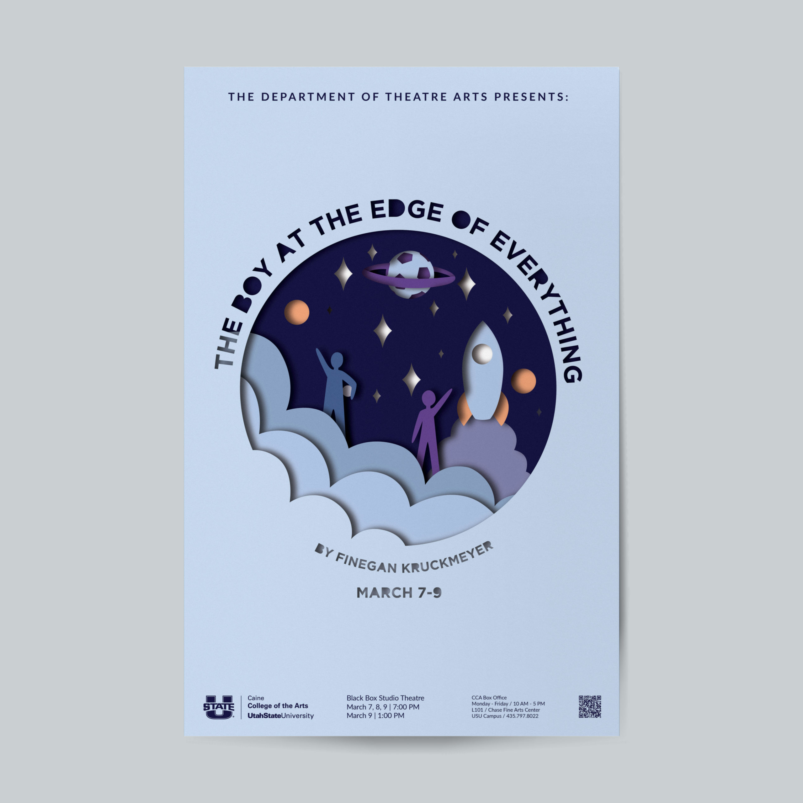
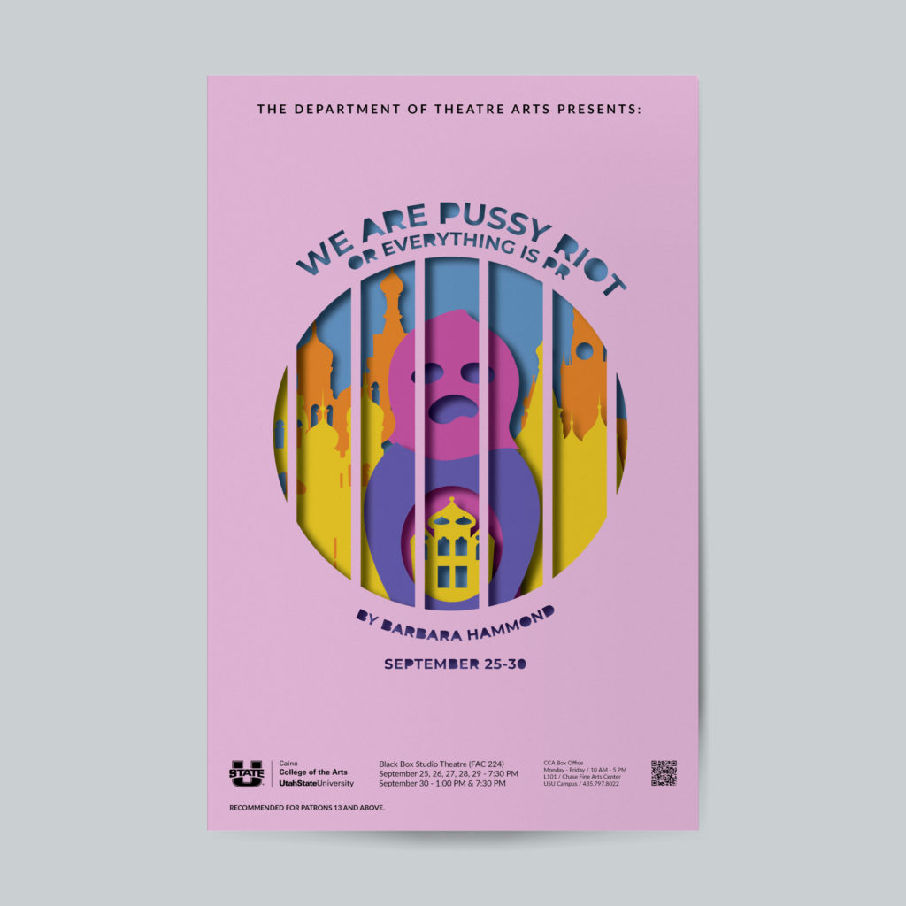
Theatre Season Poster Series
Working with the theatre department, we devised this series of posters to bring a sense of unity and visual recognition to their 2023-2024 theatre season. The shows covered a broad variety of topics ranging from comedy to light hearted childhood imagination to punk rock protests and bitter tragedy. To encompass all of these genres, I decided to work in a style that resembled shadow boxes. This style would bring that sense of unity while allowing me to play with layers and depth to create a sense of the story happening within the frame.
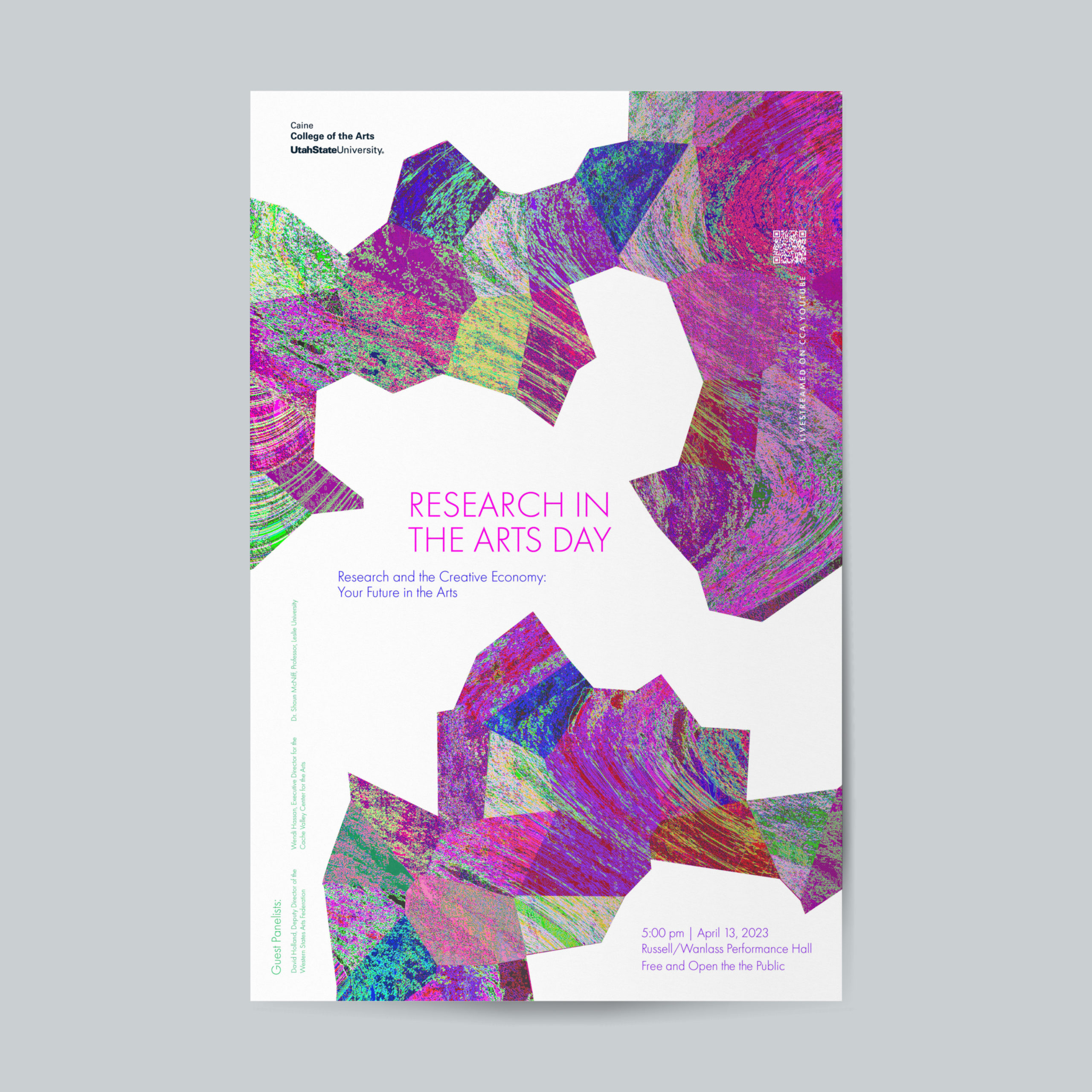
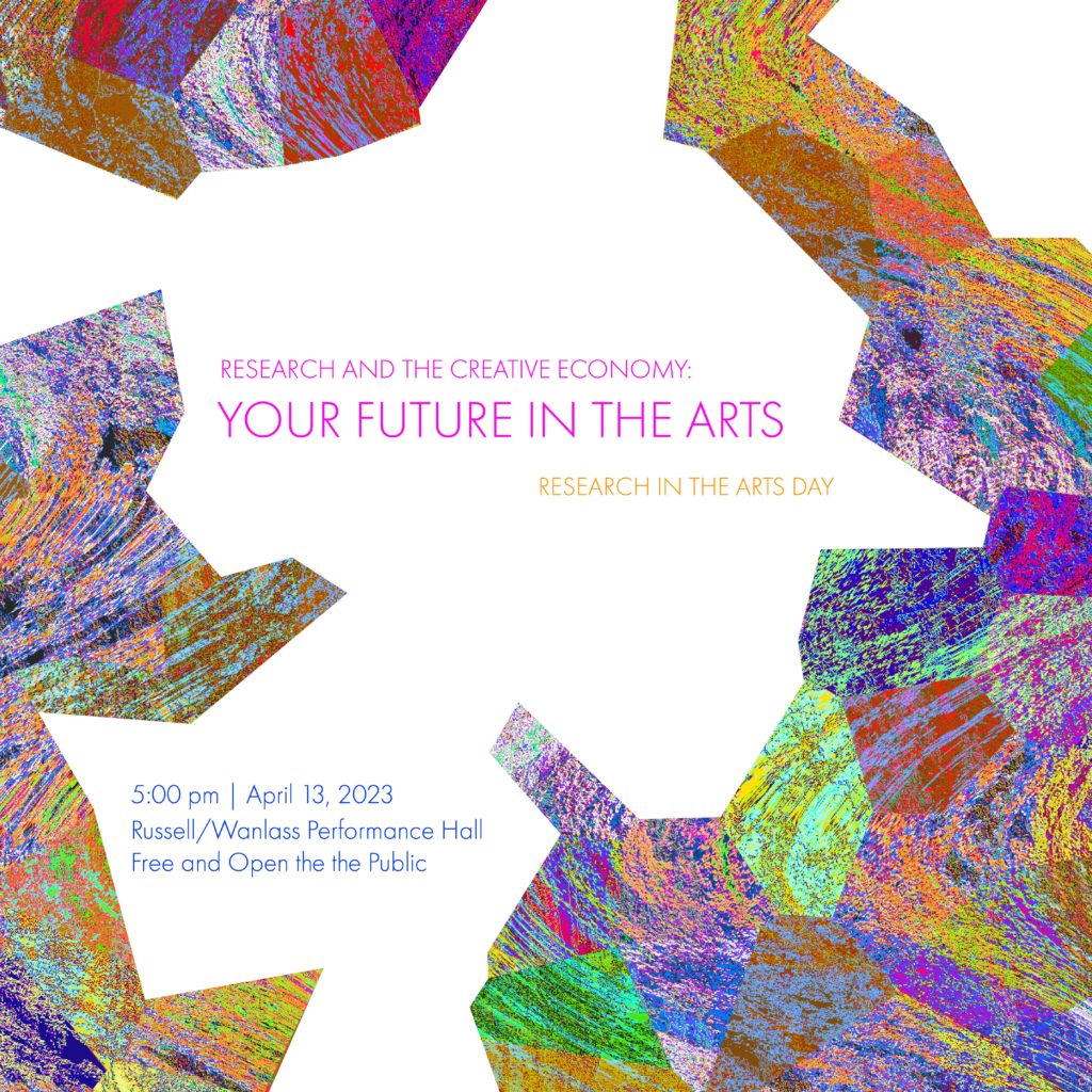
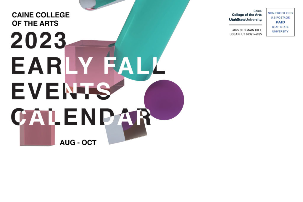
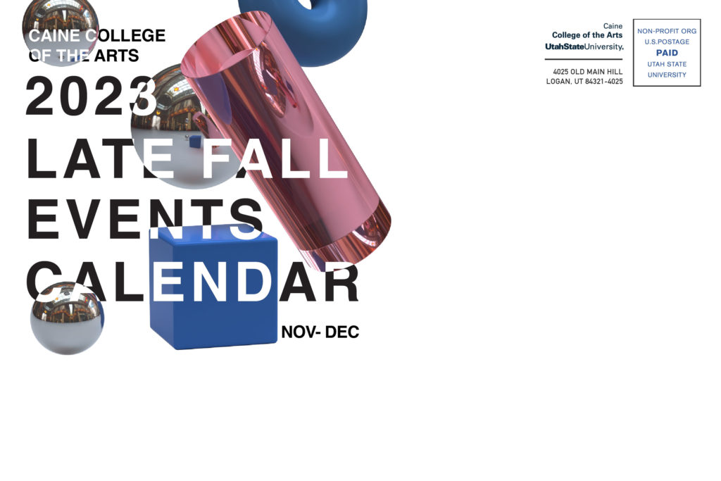
Research in the Arts Day
Research in the arts is a broad and somewhat ambiguous topic. This event called for research from all disciplines in the arts, and I wanted the marketing materials to feel inclusive yet innovative. I decided to take an approach that felt abstract with the shapes and the colors. However, there is the texture over the image that ties the pieces together and adds an element of the digital or futuristic quality to the overall image. The pieces fit like puzzle pieces, but yet there are gaps indicating that some of that future is unknown and the need for research continues.